Spriting guide
Learn to sprite here with this guide! All examples in it, aside from the official sprites, are mine and are not to be taken off this page without appropriate credit - well, except I'm not going to do anything if you steal the finished recolor examples because recoloring is the simplest thing in the world and you could as well have made it yourself. If you take anything else you'll have to face dire consequences. Scorplack, the scratch spriting example, is not to be taken at all even with credit.
The section "Things to Know First" is, well, things you need to know first. If you already have some spriting experience, you've probably figured that stuff out already; it's just the very basics of spriting, what it is, preaching about not saving them as .jpg, etc. as well as some sprite resources. "Popular Spriting Categories" has several tutorials each focused on a certain area of popular spriting, such as recoloring, revamping and splicing, that go through the step by step process of making such a sprite; note that there is a reason for the way they're ordered, so I don't recommend skipping straight to the splice part, for instance, just because you're most excited to start doing those. "In-Depth Tutorials" contains more extensive material on how to master some of the techniques used in spriting.
Skip to section...
Things to Know First
Popular Spriting Categories
In-Depth Tutorials
- Closing Words
Things to Know First
What Is Spriting?
A sprite (note, by the way, that a "spirit" is a completely different thing) is basically a 2D image of a character or object from a video game. When it comes to Pokémon, the sprites referred to are usually Pokémon sprites and sometimes trainer sprites from the handheld Pokémon games, most of the time the Advance or DS main series games except in the case of revamps. This guide will not touch on trainer sprites at all, as I myself am not very skilled with them, but mostly they use the same methods applied to different sprites; the main difference is that they can have a slightly different shading style.
Pokémon sprites are pixel art. That means you should always follow these rules:
- Do not save them as JPEGs (i.e. don't save them with the extension .jpg or .jpeg). Even if somebody is holding a gun to your head.
- Do not resize them. By all means use the magnifier/zoom tool to make them easier to work with, but never use paint program tools to actually make the sprite itself bigger or smaller; it always looks terrible.
- Do not mix sprites with other types of artwork or even different styles of spriting (such as sprites from other games, with more/fewer colors, drastically different styles, etc.). It's usually very noticeable and looks silly.
- Sprites are small. If you're spriting in Paint, then resize the image frame down to fit around the sprite before saving it.
- The only tools you should use on them are a one-pixel pencil tool, maybe a slightly larger eraser tool (which must, in better paint programs, be in Pencil mode), a Paint Bucket tool that definitely has anti-aliasing off, and some selection tools that also have anti-aliasing off. Basically, don't use anything anti-aliased on a sprite. Anti-aliasing is when instead of being blocky and pixely like a sprite, a tool's output is automatically soft and blurry. Most versions of Microsoft Paint have no anti-aliasing, so if that's what you're using, don't worry about it; in the 2007 version, however, it apparently does have anti-aliasing on the Brush tool, so don't ever use the Brush tool on a sprite.
If you make sure to follow those, you should be fine against the very basic deadly sins of spriting.
Where to Get Sprites
Before you can do any sprite editing, you have to get the original game sprites somewhere. You can use my Pokémon Sprite Generator to get the main series sprites of the Pokémon you're going to work with quickly, or, if you need sprites other than those included in the sprite generator, you can always look up the Pokémon on Bulbapedia and click the "Sprites" section. If you want to download all the sprites from the post-Advance games for use, you can also always get my sprite packages.
Popular Spriting Categories
Recolors
What you will learn: Colors in sprites, how to change colors
This is the first thing you should learn, as you should know how it works before attempting anything else - you'll need to know the basics of this if you're going to be any good at all.

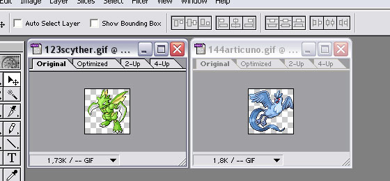
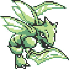
What you see here is a Ruby and Sapphire Scyther sprite - a very typical sprite color-wise - with its color palette beside it. Each of the green shades has been given a name; most sprites' colors include analogous shades, and this guide will use the names given here to refer to these shades. The "outline shadows" are always black (or ever-so-slightly off-black) on Pokémon sprites - remember this if you want your sprites to look like they could really be in an actual Pokémon game.
The Rules of Recoloring
- There is a reason it has all those shades of green. It's called shading, and it's supposed to be there. Do not recolor two different shades with the same shade, barring a few exceptional cases where the original sprite has too many shades for the color scheme you're going to give it. Even worse, don't recolor, say, the highlight color to be darker than the base color; the relative luminosity of the shades on the original sprite should always be maintained on the new one.
- There is a reason all the shades on the main body are green, too. Don't make the highlights blue and the base color red; it makes no sense and is eye-hurting.
- The outline base and outline highlight colors are also colors. When you're recoloring, you must also recolor the outlines. It isn't always very noticeable when the sprite isn't zoomed in, but a trained eye will see it and it looks extremely unprofessional once you do zoom in.
- The outlines must be reasonably dark. If you're recoloring a sprite in a relatively light color, be careful to make the outline base color sufficiently dark to make the outlines clear. If the sprite you're recoloring has considerable use of the shadow color as an outline highlight color, then recoloring it to be very light may look odd; in such cases, you should either stick with the outline base color in all but the very lightest areas or create a separate outline highlight color that's darker than the shadow color.
- Do not use the Paint default colors to recolor under any circumstances. If you're using paint, go to Colors > Edit Colors > Define Custom Colors... and there you can make your own color. Be very careful not to make it too bright. Your best bet is in fact usually to find yourself some other sprite of a normal or shiny Pokémon that has approximately the color you're looking for - that will ensure the colors look decent.
If you can't find any other sprite that has quite the right color, pick the sprite's base color with the color picker. Go to the advanced color selection menu (in Paint, it's Colors > Edit Colors > Define Custom Colors... as I said earlier; in Photoshop or ImageReady, you just click the foreground color in the toolbar). Now play around with the Hue value until you've found the color you want; remember or write down the current value. You can also raise or lower the Brightness/Luminosity or Saturation values, but if you do, remember how much you raise or lower them. Paint a pixel or small square of this color somewhere beside the sprite, and then do the same for the other colors in the sprite - change the hue to the same value as you changed the first color to (or possibly something slightly in the blue direction from there for shadows) and lower/raise the brightness/luminosity by the same number as you did for the first color, if you did at all. Then put a pixel/square of it next to the previous color. If the color doesn't look quite right after doing this, you can tweak it slightly. Of course, you won't have to do this for the black, and I recommend not raising the brightness of the base outline color if you've been doing that for the other colors, since like I mentioned above, most of the outline should generally be quite dark.
Obviously, if you're taking the colors from another Pokémon, you can take them straight from the other sprite and don't need to make a color palette.
When you've picked all your colors, move on to recolor the sprite accordingly. In better paint programs, it is possible to set the Paint Bucket tool so that it paints all pixels of the same color (in Photoshop or ImageReady, you check off the Contiguous option). In Paint, there is a rather complicated trick. First, select the color picker and left-click the highlight color on the sprite you're recoloring. Then, again with the color picker, right-click the highlight color you're going to use. Next select the Eraser tool, make it the biggest it can get and right-click and drag over the whole sprite. The old highlight color will magically be replaced with the new one everywhere you touched it with the eraser, while all other colors will be unchanged. Repeat this for the other shades too. As per rule 3, make sure not to forget the outline base.
And... that's it. Really. To demonstrate the process, I'm going to screenshot how I recolor that very Scyther sprite, both in Paint and ImageReady 3.0.
ImageReady
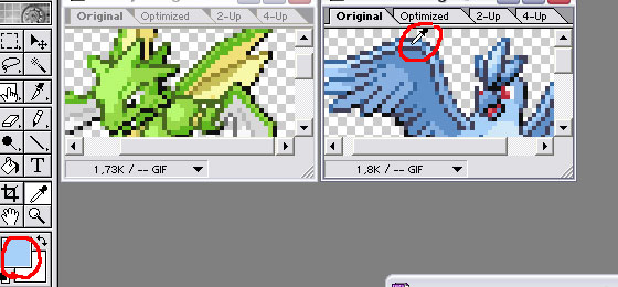
I used Articuno blue for this, just because I couldn't be bothered to make two screenshot guides both including the whole finding-colors process.
- Open up the two sprites...
- Pick Articuno's highlight color with the color picker - Articuno actually has quite a few more shades than my Scyther example, though.
- Use the Paint Bucket tool with Contiguous off to color Scyther's highlight color.
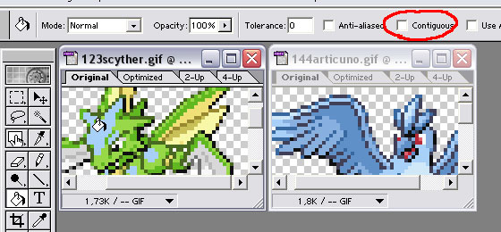
- Proceed with the rest of the shades...
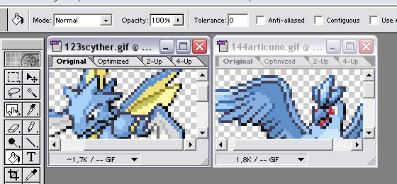
- Recolor done!

Paint
In this one, I'm going to make it dark blue, so you get to see the color selection.
- I like to use the Paste From command under Edit to get the sprite(s) into the document if I have to work in Paint. Of course, I have them all saved to my computer - you might just want to copy them straight from the Internet.
- Magnify it nicely...
- Pick the base color with the Color Picker.
- Never forget the Edit Colors command, kids!
- The Edit Colors menu looks like this; note the "Define custom colors..." button you have to click, and the three values you might be editing - Hue controls the horizontal location of the pointer on the color square, Saturation controls the vertical location, and Luminosity controls where it is on that slider on the side. I don't recommend moving the pointer with the mouse, considering all the calculations from those numbers we'll be doing, but the luminosity should be fine, as long as you remember what the value started at.
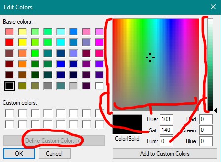
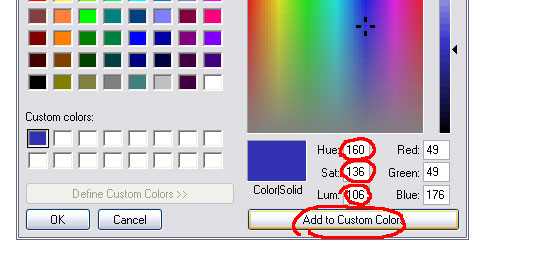
- I'm making the Hue 160, lowering the Saturation by 20, and the Luminosity by 30. Click the Add to Custom Colors button and then OK on the main Edit Colors menu.
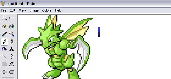
- Now just paint a little square off by the side with that color in, and then do the same with the other colors.
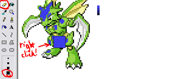
- Time to color it in - remember, right-click the color you want, left-click the color to replace, and right-click with the eraser.
- Now that they're on the sprite, it's obvious that the colors were too saturated and rather too dark - normally I'd fix that, but I'm feeling lazy.
- Erase the palette, de-magnify, click the little dot in the bottom right corner of the canvas and drag it so it fits around the sprite... and congratulations, you're done.
- Enjoy the finished product - always remember to save as .PNG when working in Paint if you want the colors to come out right.

Congratulations, you've gotten through the recoloring guide! Once you've mastered this, you can move on to the next part.
Revamps
What you will learn: Shading, spriting style, outline shading
Revamping is basically the art of taking a sprite from one of the pre-Advance games and recoloring/shading it to resemble its post-Advance counterparts. Newbies in the field do this simply as if they were doing a slightly more complicated version of a recolor - they replace the colors, if expanding the palette a little bit, save it and call it a revamp. It isn't.
R/B/Y sprites had four-shade monochromatic palettes and G/S/C sprites had four-color palettes, while the later games have sixteen-color palettes. But revamping is not about the colors themselves. It's easy to look at the limited older sprites next to the brightly-colored newer sprites and think the main difference is those pretty bright colors the GBA and DS can produce, but that's not the case. Revamping is about style. Because the older sprites were so limited, certain stylistic choices were made, and without accounting for that, a revamp can never look genuinely like it was taken from a newer game. This makes revamping very fundamentally different from recoloring - it calls for thinking about and working with stylistic aspects instead of just replacing colors with other colors.
The Rules of Revamping
- Don't stick to the original sprite's shading unless it genuinely results in the sprite looking stylistically similar to the newer sprites.
- Don't stick to the original sprite's outlining under any circumstances, ever.
- Especially don't stick to the possible manual anti-aliasing on the outside edges of the outline in the original sprite. They worked on the originals because they were only ever shown on a white background in the game; in the newer games, and on the Internet where you may be showing off your sprites on various backgrounds, this results in very visible, horrendously ugly colored "dots" around the outline.
- In general, mimic the newer sprites' style in one and all.
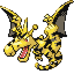
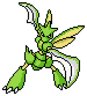
So say I'm going to revamp the Yellow version Scyther, since I'm being Scyther-obsessed in this guide. Here it is:

It doesn't look that bad for a sprite with only four colors, does it? However, if we make the background black instead of white...

...not anymore. See those dots around the outline? That's because of the manual anti-aliasing I mentioned above - lighter pixels were placed on the outside of the outline in order to make it look smoother on the original white background. This is especially a problem in Yellow, hence why I chose the Yellow sprite for this tutorial - the artist for the Yellow sprites really loved anti-aliasing.
Let's put it on a white background again to make it clearer what I'm doing, but knowing this, we'll of course fix those dots at a later stage. I'll make it a little larger, too:
In the magnified version you can clearly see the lighter pixels on the outside of the outline that produce that ugly dotted effect on dark backgrounds. On the white background, they look fine - but Pokémon sprites are no longer exclusively on white backgrounds, so this will have to be remedied.
Now, as it happens this particular sprite has pretty good shading in its original form. It uses white for the highlights, the lighter shade of green for the base color, the darker shade of green for the shadows and outline highlights, and black for the outline and the very deepest shadows. It has a consistent light source and the shading is reasonably placed. All in all, this means we can use the original shading here as a basis, rather than having to make up most of it as with many other sprites.
This means we can now go and color the Scyther to be shaded exactly like the original Yellow version sprite, but with post-Advance colors, here Ruby and Sapphire colors because this guide is old. First of all, however, the outline will have to be completely redone, as is the case with all revamps. We color the whole outline black pixel by pixel, including the anti-aliasing, and then change the colors to the R/S colors (it's best to do that pixel by pixel with the Pencil tool, not with the Paint bucket tool - otherwise you may inadvertently fill in areas that should be a different hue altogether, like the wings here). Let's see how it looks now...

With the outlining all-black, it looks very 2D and cartoony - not how we want the end result to look. There are also some clusters of black where the anti-aliasing was blacked out. To fix that, we take the base outlining shade for every color and color all of the outline except the shadows in that color, and remove the clusters so that the outline is always one pixel wide.
Now, you may notice that the R/S sprite actually also features some anti-aliasing on the outside of the outline. This is a bad idea and only makes the sprite look worse; you should avoid this in your revamp. On the other hand, lighter pixels on the inside of the outline are a far better idea and can make the sprite look smoother against dark backgrounds while giving the same overall stylistic effect as the occasional outside anti-aliasing in the official sprites.
Let's see how our Scyther looks now with this applied to it...

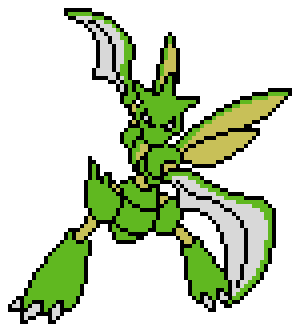
Hmm, technically it doesn't look too bad. But what if we compare it to the R/S sprite?

Notice how the revamp just looks different from the R/S one. This is a quintessential stylistic difference that should be fixed when we make a revamp. The wings on the R/S sprite are shaded differently - the wing "shadow color" is really used where the front wing overlaps the back wing - and the R/S one seems overall lighter. Why? Well, the original Yellow version Scyther had white highlights, which contrasted much more with the green main color. The highlights were really used to apply shine, so very little of them was used. The R/S Scyther, on the other hand, has a whole lot of the highlighting color all over the place. Because there is so little of the lighter highlighting color on the revamp compared to the R/S sprite, it looks darker overall. To make them seem to match up, we need to change the shading to the style of the official Scyther.
We've also yet to do the outline highlighting at this point. Put some of the shadow/outline highlight color on the outlines in the very most highlighted parts, trying to keep the overall quantity of this color similar to how it is in the R/S sprite. Again, place pixels of the outline highlight color on the inside of the outline rather than the outside.
We can also look at the FR/LG sprite for reference for some more edits, such as in the face, since even though we're coloring it R/S style, the pose is a lot more similar to the FR/LG sprite (in fact, the FR/LG sprite is probably a rough remake of the Yellow pose). Conveniently, that's also where I got the red in the mouth from.
Note that when I revamp, I often alter the Pokémon's actual shape to conform better to its modern-day design; there is no requirement that you do this, if you prefer how the design looks in the older sprite or just don't think you could do it well.

And it's finished. Let's see it with a transparent background at actual size - try looking at this in a style with a black background and noticing how it's even smoother than the R/S sprite thanks to the "inside anti-aliasing" I applied:

Done! We changed this:
Into this:
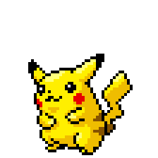
Now. That was a Yellow sprite, one that already had pretty good shading. A lot of the time, however, you're going to be revamping sprites whose shading is very lacking or almost nonexistent, especially because most G/S/C sprites used their palette's two colors to produce two different hues, leaving no extra colors to create shading with. So let's take another example, this time one of those sprites: the Silver version Pikachu.


Let's magnify it as usual:
First things first: let's make the entire outline black and switch out the colors, like we did with the Scyther earlier.

Ick. See how it really doesn't look that much better than the original sprite? That's because there is almost no shading. Some people do this to G/S/C sprites and think they've made a revamp, but all this is is a cheap recolor with cartoony outlines.
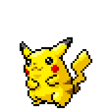
Now, see those highlights? The spots that used to be white? They're facing the top left, so clearly, that's where the light is coming from. (In fact, all Pokémon sprites have their light source in the top left if they're facing left and top right if they're facing right.) We're going to have to add all the shadowing, and that goes where the light is not coming from. If you imagine the light is a can of spray paint and you spray it in Pikachu's direction from a static position in the top left, the parts that get colored with the spray paint are the parts the light hits, and the shadows should be the parts the paint doesn't reach - where the light does not fall directly.
Note that Pikachu is mostly made of curved surfaces, which means that the shading should also curve around the shape of the body. The tail is not curved; however, it is behind Pikachu and should therefore have a lot of shadowing except at the top. (Look at the R/S sprite for reference!) For more detailed instructions on shading, if this doesn't really make instinctive sense to you, see the in-depth tutorial on the subject.

There; that's much better and more 3D. Now proceed to shade the cheeks and the stripes (look at the R/S sprite for reference again.) I noticed here that the black ear tip is noticeably bigger on the R/S sprite than on this one's left ear (our right), so I decided to make it bigger on the revamp before shading it, but you don't have to if you don't want to. Finally, some of the highlights look a bit awkward, so let's change them.

On to the outlining. Now, Pikachu has four shades in its outlines rather than three: there is the black, a dark brown outline base color, a medium brown outline highlighting color, and also the light yellowish brown that is used as the shadow color. The R/S Pikachu uses the shadow color only on the very lightest parts of the outlines, as a sort of extreme highlighter, while the general outline highlighting color gets used for the extreme shadow on the foot. We'll do the same on the revamp - remember, always imitate the style of the newer sprite.
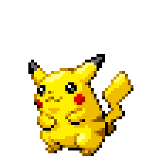

And now it should be finished. Let's look at it normal-sized and transparent:

We've turned this:
Into this:
And that concludes the revamping part of this guide. The concepts revamping should teach you - shading and a sense of spriting style - are extremely important; I suggest getting experienced with revamps at least before you start doing scratch sprites or pixel-overs.
Splices
What you will learn: Composition, small scratch edits
Splicing is when you splice together parts of two Pokémon sprites. It is a general-purpose method used for several ends: you may simply be adding parts onto a Pokémon (e.g. adding wings to a Pikachu to create a winged Pikachu), mixing multiple Pokémon together (e.g. taking a Scyther and a Butterfree and combining them into one Scytherfree), or even nabbing parts from many Pokémon to create a whole new creature that doesn't look obviously like any of the parts used. Regardless, the same general principles apply to all splicing:
The Rules of Splicing
- Do NOT use the same body part twice. If you want to put Charizard wings onto some other Pokémon and one of its wings is only partly visible in the sprite you're copying from, you do not solve this problem by just putting the other wing on twice, whether you keep it exactly the same or flip it around. Perfect symmetry or identity in significant body parts immediately makes a sprite look fake.
- DO flip parts if the direction they're facing doesn't match up with the body you're trying to put them on.
- DO recolor the end result to one consistent color scheme.
- DO edit the shading style to make sure all body parts that are colored with the same color match. This also applies if you've flipped any parts - you'll need to change the direction of the light source.
- DO add in or edit parts from scratch when that is called for.
Now, how do we splice?
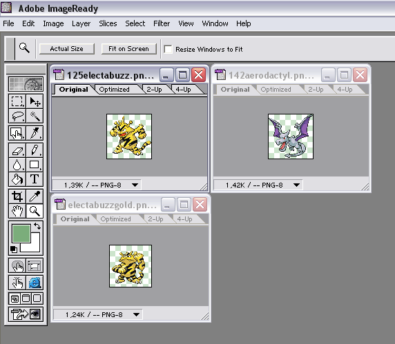
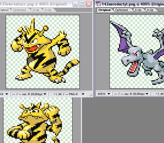
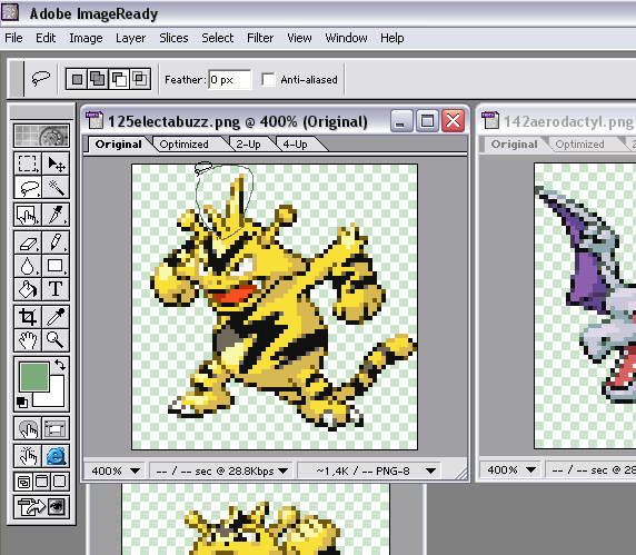
Firstly, you need to get the sprites into your paint program, obviously. You might want to use sprites from multiple games or even ones you've revamped (but only if you can honestly look at your revamp and the official sprite side by side and not tell which is which except for recognizing the pose and possibly size). Here, I'm going to do an Electabuzz/Aerodactyl splice (generated randomly by the sprite generator); I'm going to use the FR/LG sprites for it, and I may also use parts from my revamped Gold version sprite, so I'm opening that too for safety. I don't think I'll need any other sprites for now.
Now, decide which parts you want to use for the splice. I have decided that I want Electabuzz's little antennae, the hair on its head, the markings, probably the sides of the head, the end of the tail, the claws, and the arms, while keeping everything on Aerodactyl except the end of the tail and the horns. Then remove everything you're not going to use - just erase it carefully, making sure to remove everything you were going to remove and nothing you weren't going to remove. Now, in my case, even though the markings and sides of the head are probably going to be drawn from scratch onto Aerodactyl itself, I'll still need the sprites for reference, and I'm using ImageReady where the Lasso tool is quite precise, so I'm not erasing any of them. In Paint, however, it is just about necessary to erase the parts you don't need, simply to have room to select the ones you do need; if you need to keep the full sprites around for reference, just copy and paste an extra copy of the sprite before you erase anything.
Now you should have all the parts for your splice ready.
Next, select the parts with the lasso tool and get them onto each other. In Paint, you have to drag the part you want to be in front onto the part that you want behind. In a layered paint program, you can just copy the parts, paste them into the other image, and then drag it around independently and switch the order of the layers. Place the parts carefully - if you're putting on a new tail, don't make it come out of the middle of the back unless you're intentionally making something that looks absurd. Don't mind the gaps that may be left in there somewhere - placing the parts so that the sprite looks right is more important than leaving no gaps for now, because you'll fill them in anyway.
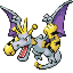
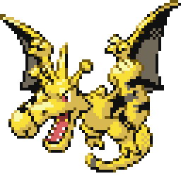
Now we have the first version of our Aerobuzz, the way some spriters would leave it - you don't really need to see the Electabuzz anymore, so no more screenshots:


But we're not just some spriters. After you're satisfied with the overall composition of your sprite, you can start filling in the gaps from scratch. Basically, you draw in any missing parts pixel by pixel with the pencil tool, and make carefully sure to shade them properly - see the revamping part, which you should have read, on shading both body and outlines. Usually these parts will be quite small; if they aren't, I suggest you change your plans for the splice until you're a bit more experienced. In my case, it's mainly the right (our left) arm, but I'm also erasing a pixel from the tail end that looked odd.

Anyway, when you've drawn those in, it's time to recolor. When mixing, you'll usually want to use the colors of the sprite that's less prominent in the mix as it is so far - which is almost always the accessory Pokémon rather than the base. In this case, that would be Electabuzz, and I've already assumed that with my plan to give it Electabuzz's markings. When adding parts, you'll on the other hand want to use the colors of the base, since the desired effect is not to make it look like both of the Pokémon spliced. For supersplices of many Pokémon, the colors are often taken from a completely different Pokémon or made up (see the recoloring part of this guide).
But this is a mix we're talking about, and therefore we're going to recolor it with Electabuzz's colors. We do that exactly as we'd have done it if we were simply recoloring a normal sprite to another color. (Meaning you should go read that recoloring guide if you haven't already. Now.)

But no, no, no, don't stop yet, even if you have no plans to start putting on markings. There may be slight oddities in the shading now - maybe you flipped a part so now the shading is backwards, or you put a part somewhere and now it would cast a shadow onto the rest of the body, or a part used to be shadowed by another body part but isn't anymore. Additionally, the shading style might be different between the Pokémon that you used - one might then look darker than the other (see the revamping guide). Therefore, you might want to change the shading a bit to fit better on your splice. I'm going to edit the outlines and take out some pesky dots, but you don't need to if you don't want to - they're official flaws, after all.


Now, since I was going to use the markings, I'm adding them on. Obviously, I need to adapt them to the surface of Aerodactyl's body and shade them like on Electabuzz. This is probably the hardest part of this particular splice, but that's mainly because it's about scratching quite a bit of stuff; if you aren't very good at that, leave that kind of thing alone for now. When working in a layered paint program, I highly recommend putting markings and such on a new layer; in Paint, copy and paste a copy of the sprite before you start doing something like this.
I also changed the claws into Electabuzz-like claws, as I intended.

Now our Aerobuzz is ready to roll, and you know how to splice.
Pixel-Overs
What you will learn: Outlining, extensive scratch coloring/shading
What is a pixel-over? Well, it is when you take an existing image, possibly resize it, and then pixel by pixel draw another image on top of it that imitates its outlines and basically turns out looking like a sprite version of the image. If that sounds confusing, I've got some examples of my own, made from Sugimori art:


For comparison, here is the actual Sugimori art of those two:
As you can see, the colors are different - on my pixel-overs, I used the colors from the Ruby and Sapphire sprites - but the pose is the same. Then the pixel-overs are smaller because I happened to make them that way - a trained eye might notice that they are also a bit larger than the official sprites. That's all just because I happened to choose this size when making them; they could have been any size.
Pixel-overs are, in a way, "pseudo-scratching". The outline's shape is not yours, but the sprite technically is - you did not use any parts from other sprites to make it. The next step would be to draw your own poses and make pixel-overs from them - then you technically have a scratch sprite. That will obviously not be covered specifically, because the method, once you start working at the pixel level, is the exact same as when you start with somebody else's art.
Now, to start with, just find some suitable art to pixel-over. I'm going to continue my Sugimori series for this guide, but other official art you can pixel-over from is for example trading card art. Then, of course, if you do have some nice pictures that you drew yourself, even better. But I'm going to make a Scyther pixel-over because I like Scyther.
First off, we need to resize it. The size I like to have for my Sugimori pixel-overs is something like roughly 140-160 pixels when the dimensions are put together, so I made it this. The official Advance sprites are 64x64 pixels at the most, the fourth-generation sprites are 80x80, and in the fifth generation they're up to 96x96. Also note that I chose to make the result jagged even though ImageReady has the ability to make it smooth - this will make the outline less blurry and thus easier to follow. To get the resizing option, go to Image > Image Size in ImageReady/Photoshop; in Paint, you can go to Image > Stretch/Skew and then stretch.
When you're a beginner, make it relatively small. Scratch spriting and pixel-overing, whether you believe it or not, are an art form where the difficulty of creating one depends much more on the size of the sprite than on anything else. I've seen a list of spriter "ranks" where in order to be an "expert" one had to be able to create 100x100 pixel-overs from 2000x2000 images, with it noted that "the smaller, the better". This is not true. Making a big pixel-over of an image is not only harder than a small one, but exponentially so, and not only because you have so many more pixels that you need to consider one at a time, but because there are all sorts of things you can get away with in a small sprite but not in a bigger one. Sure, it is more difficult to fit details into a 100x100 image than a 200x200 one, but that isn't a matter of skill so much as how well the original image was chosen. As long as the pixel-over is large enough to fit the detail you need on, for the love of all things holy don't make it larger than that for the hell of it until you really know what you're doing.
Anyway, now that it's small, magnify it. Choose a darkish color that does not appear in the sprite - black is fine in some cases, but not all - and start tracing the outline of the art. (In layered programs, do this on a new layer.) You don't need to follow it exactly if doing so would make the outline look worse - all the advice given in the outlining guide in the In-Depth Tutorials section to make an outline look smooth is more important than making each particular pixel exactly like it is in the original art.
You may also have to do "pseudo-outlines"; basically, use a different color, not necessarily dark but still one clearly distinguishable from the original art, to mark a narrow area that will be separated from the rest only by color separation but not with an actual outline, such as the green edge on Scyther's scythes and wings (see sprite below). This generally applies to anything that is only one or two pixels wide. There, it would look very messy if you tried to make an outline of it in the same color as the rest of the outline. Instead, just color the area completely in the color of your choice.
Now, I've finished the outline roughly, and then it's time to erase the original art. (It's often good to keep a copy of it somewhere for reference with the shading, though.) Then make the outlines black if they weren't already. Here's how it looks now:

Coloring time. Using the Paint Bucket tool, color the whole sprite with your base colors... unless you're like me and like to start with the shadow color. I'm going to do the latter, but you do whatever you want. Of course, our Scyther doesn't look particularly good after this treatment...

But no worries; we're about to fix that. Now, using the basic principles described in the shading guide, add the first layer of shading - the base color in my case, but possibly the shadow color in yours. Scyther is already looking better...

And then, finally, it's the highlighting.

Now that that's done, we can shade the outlines, using the technique described in the revamping guide, make the sprite transparent if we're working in a good paint program, and Scyther is done.

Scratch Sprites
What you will learn: Drawing sprites from scratch
When scratch spriting, you basically draw the sprite from scratch with the Pencil tool instead of pixeling over an existing image. For very small scratch spriting, you'll usually be fine with drawing it pixel by pixel, but for something around the size of a Pokémon sprite, it is often better for the larger body parts to just drag the pencil tool and draw. However, this is still spriting, and you should still be keeping the canvas magnified while you draw.
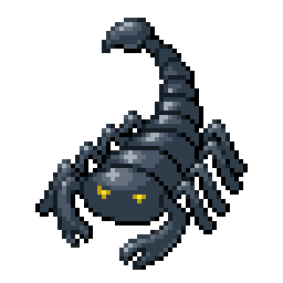
Now, for the sake of the guide, I'm going to make a scratch sprite of the first completely original fake Pokémon I ever made, Scorplack.
So, what I start off with is magnifying the 64x64 canvas (for an Advance-sized sprite; for a D/P-sized one, it would be 80x80, and for a B/W-sized one, it's 96x96) and drawing the Scorplack's head. It's a scorpion Pokémon whose body is made from a row of basically oval segments, and I know that if I tried to draw an oval pixel by pixel, it would probably end up looking too regular and oval-shaped, so I'm going to start by drawing the head segment, roughly, by hand using the Pencil tool.
It is very messy and ugly right now, obviously, and the first thing you need to do when you have made any hand-drawn outline in a sprite is to realize how messy and ugly it is. This is not how a sprite looks. To make a proper, smooth-looking, one-pixel outline, you need to go over this little scribble pixel by pixel, mostly erasing some and perhaps adding some, while keeping in mind the principles described in the outlining guide in the In-Depth Tutorials section.
There, much better. Now we'll add the remaining segments of the body and tail and the sharp tail stinger using the same method, drawing and smoothing one segment at a time. I also moved it to the right because I want to be able to fit its legs on. I really recommend doing the drawing one body part at a time - trying to draw the entire sprite by hand before cleaning up any of the outline will result in a mess that will be difficult to clean up once you get to that. Also, this should be very rough - if you have minute details, leave them out entirely when making and smoothing the initial outline of that part.
Now, the legs are a different matter. They're very narrow but simple and smaller than the body, making them prime candidates for drawing them pixel by pixel. With an idea in my mind of how the legs should look, I draw one leg coming out of each segment of the actual body. I'll start with the ones on its right side (our left), since they won't be overlapping the body:
Here I actually committed the sin of making all the legs the same, but it doesn't really matter in this case - we're dealing with a set of identical, narrow legs that probably wouldn't be different enough to make a whole pixel's worth of difference. That being said, I'm also going to use that to excuse that I (gasp) copy-flipped this same leg for the other side of the body. Bad me. But hey, the shading is going to be different, so nobody will notice.
Now, it's time for the hardest part of this sprite: the pincers. Scorplack is a relatively simple Pokémon, being made up of those relatively large, rounded segments and identical legs, but then it has pincers, which will actually require a bit of finer detail. Seeing as I suspect they will completely wreck the whole thing, I'm making them on a new layer to be safe, which is a good habit; if using Paint, you should just copy and paste a safety copy of the sprite before adding anything you think might ruin it.
Hmm, didn't turn out as bad as I thought it might. As you can see, that was extremely rough, and does not include the actual detail; I'm going to smooth the rough idea first so that I can tell better how it looks on the sprite before adding the detail.
Now I'll take a good look at it and make sure there is nothing else I want to add on it or anything I want to move around or anything, and once I've decided I'm satisfied, I'll merge my layers and finish the detail in the pincers.
Now, Scorplack is black, so I'm making a dark blueish gray color for it. It also has glowing yellow spots on its head that look like eyes; that color won't be hard to do. As it happens, that's all the colors there are in this sprite; Scorplack isn't very colorful.
Now, time to bring out the shading guide again. Here, I'm actually going to do something unlike what the shading guide describes: instead of adding shadows everywhere that faces away from the light, I'm going to focus all the shading in the sprite towards the highlighting and shine (this is more easily gotten away with here, because the sprite is rather dark, which mostly prevents the shadows from looking flat). In addition to using the color already on the sprite as the shadow color rather than the base color, the 'base color' now essentially becomes the first layer of multi-layered highlighting.
Not much to say here; we just add more highlighting on top of what is here, this time using smaller rounded shapes.
Finally, the shine: a whitish-gray color applied in small spots. Notice how much shinier it looks after that than in the previous step - shine really does work! I also added a bit of shading to the eye-spots.
In the last step, we do the outline: a base outline color that's darker than the shadow color, shadow color used for outlining the highlights, and in fact I also brought out the base color for some of the very highlights. I also modified a bit of the shading and decided to add some reflected shine to the tail stinger and left (our right) pincer. Then it's just making the sprite transparent, and it's done.

Other Spriting Categories
These aren't the only types of spriting around, though they form the basis for most other spriting. Some other kinds include...
- Customs
- Usually sprites that might be made from a base, but have been edited from scratch beyond recognition.
- Devamps
- The opposite of a revamp: instead of taking an older sprite and editing its style to look like the newer sprites, a newer sprite is taken and its style edited to look like the older sprites.
- Disguises
- Sometimes referred to as "extreme recolors" or something of the sort, but basically one Pokémon that has been edited to the full color scheme of another including markings, details, etc. and may have some spliced parts.
- Edits
- Normal sprites that have been edited slightly in some way or another, such as by closing a mouth, adding a prop or whatever.
- Overshades
- Sprites that have been edited to have more shades than the ones they originally had. I think overshading kind of misses the whole point of spriting - working with a limited palette is one of the interesting things about pixel art, and overshades tend to look fake and gradient-y - but it's fairly popular anyway, so I must grudgingly include it.
- Posers/reposes
- Pretty much disguises taken to the extreme, where the sprite is actually edited to the point of showing another Pokémon in the base's pose.
- Retypes
- A Pokémon is taken and edited to look like it is of a different type than it really is. A well done type change usually contains scratch parts as well as bits of other Pokémon.
In-Depth Tutorials
Outlining
Here we will cover the nitty-gritty details of making an outline. This is not a matter of outline shading but simply creating the outline itself - thus, it mostly matters for those planning to make scratch sprites, pixel-overs, or something else they will be doing extensive scratch outlining in.
The Golden Rule of Outlining
Do not use the shape tools in your paint program.
I'm serious. That circle tool may look awfully tempting, but don't use it. The computer quite literally draws the closest pixel approximation to a perfect circle, but this is not always the best representation of a circle. Why? Because the computer is not a brain. Brains don't care how closely it approximates the mathematical definition of a circle; brains care whether they can properly see the jumble of little colored dots on the screen as a circle, and to do this the circle above all needs to be smooth. Here are four circles, two 16x16 pixels and two 24x24 pixels:

The circles on the left are drawn with Microsoft Paint's circle tool. The circles on the right are drawn by hand. Which look better? The ones on the right. Why? Because the ones on the left are drawn from a purely mathematical standpoint on circles. The ones on the right aren't shaped quite like real circles, but you can't really see it and your brain likes them better because their outline is smoother.
Lesson learned: Draw by hand when you make pixel art. Do not use those silly tools. They may know their math just fine, but they don't know how to fool a human brain.
Straight Lines
Anyone can draw an (approximately) straight line on paper, but there is slightly more to it when you're spriting. As you may have noticed when you have been working with pixels, pixel art basically happens on a grid, so the only real lines you can make are horizontal and vertical ones, as seen below (in the corner is the true size of the 4x magnified version in the main image):

But you won't get very far in the spriting world drawing nothing but squares, and that's why somebody made the genius discovery that if you, say, draw a short horizontal segment in one "row", and then another horizontal segment in the row above that, and another one in the row above that, and so on, it ends up looking like a slanted line, and likewise with shorter, longer or vertical segments:

And this is basically the core of straight lines in pixel art. You're drawing tiny segments of horizontal or vertical lines but shift each segment one pixel vertically or horizontally so that it touches the corner of the previous segment. When making straight lines, each segment at first glance appears to need to be equally long, which would severely limit your possibilities of angles for these straight lines, but it is not so; they can also have some segments one pixel longer than the others such that they appear in a regular pattern. This may sound complicated, but it isn't. The line below, for example, is one of the simpler possible such lines, with segment lengths alternating between 1 and 2:

How effective this is at conveying your line depends on a few factors including the segment lengths, the pattern you're using, and the length of the line - generally, shorter lines with a greater difference in the number of segments of each length used (such as if a line has ten single-pixel segments for each two-pixel segment) are likely to look less and less like a straight line at your desired slope and more like a straight line at a slightly different slope with a little bump on it. For this reason, sometimes you'll want to take the licence of using a simpler slope in order to prevent such a bump from appearing; to use our previous example, you could instead simply make it into a line in which all the segments consist of one pixel in order to get a smoother line.
Angles
There are more or less two ways to convey an angle in an outline. Firstly there is the corner:


This is when a horizontal and a vertical segment are joined by sharing a pixel whose actual sides touch the rest of both segments, and it is pretty good at conveying sharp points such as claws on a Pokémon. The other type is the point, which is where a single-pixel segment joins two adjacent segments that are both shifted to the same side of it:


So what's the difference and when to use which? Well, corners must invariably face either the top left, top right, bottom left or bottom right, and points must invariably face either up, down, right or left. There is no way to get around this. It is simply a fact of life, and it lets you point your angles in any of eight directions. If you desperately need the very tip to point in some other direction, tough luck. There are a few other ways to convey angles with pixels, but none of them work properly for actual outlines, so really, this is it.
Curves
But Pokémon are curvy. All living creatures are curvy. You aren't going to be drawing a lot of straight lines when making Pokémon sprites, unless you're making a Porygon.
So why did I babble on about straight lines and sharp angles before getting to the stuff you're going to be using? Because, well, essentially curves are just lines whose "slope" is constantly changing. To explain better, imagine we've got a nice, round curve like this:

Now, a true circle, as mathematically defined, has a "slope" that changes constantly as you move along the circumference of the circle. But just like we have to settle for portraying diagonal lines with oodles of little segments of horizontal or vertical lines when we're making pixel art, a pixel art circle is only a rough approximation of a true circle - you can make small pixel art of what is essentially an octagon, for example, but the brain will interpret it as a circle anyway provided that it's small enough. This quarter of a "circle" in particular, being relatively small, changes its slope only four times - it is essentially a part of a hexadecagon or sixteen-sided polygon. Here it is with each "side" colored so that you see what I mean:

These, as you can see, are all "simple" slopes - all the segments in each "side" are the same length. The brain, however, the wonderful thing it is, knows that you can make every imaginable slope using a pattern as I detailed above, and technically it could be that each point in the outline of the hexadecagon really has a "slope" different from those around it; you just see too little of that slope to be able to see the segments of it that would be a different length. So, the brain decides, while it is just a bunch of little dots and their form technically looks more like a hexadecagon than anything else, it's probably supposed to be a circle, because come on, who ever draws a hexadecagon? And the brain, like so often, is right.
For short: you draw a curve by drawing something that will, to the brain, look vaguely like the slope could be gradually changing at each point of it, and as long as you've done that, the brain of the viewer will, conveniently, fill in the blanks for you.
So how do you make a line that to a brain looks vaguely like the slope is gradually changing with each point of it? Simply by making it gradual enough for the brain to fill in the blanks correctly. Look at the following two pictures:


Now, it should be obvious to anyone that the curvy line on the left is all smooth and nice and the not-curvy one on the right is not. To figure out what it is exactly that makes them so, it would be wise to look through the lines from start to finish. Here I will assume that their "start" is there in the top right corner.
The first noteworthy difference we encounter as we travel along the line, then, is how in the one on the right, a horizontal line segment of a length greater than one connects directly with a vertical segment of a length greater than one. This is more or less a no-no when trying to make smooth curves. Generally, between any horizontal and vertical segment of a line there must be at least one "neutral" single-pixel segment to connect them in order to make the brain buy it as a curve. It doesn't matter with very small parts, like "circles" that are under six pixels in diameter, but in anything larger, the brain will feel more inclined to assume that a horizontal segment directly joined with a vertical one is simply supposed to be a corner. As you move on to still bigger shapes in your pixel art, it will also cease to be enough to have only one single-pixel segment in between them to make it look smooth, but thankfully, the shapes you will be working with in Pokémon sprites are mostly smaller than that.
The next difference between the two curves that we encounter as we go along the lines, and this one is serious, is that there is an actual corner on the line on the right. It should be obvious that corners are not something we want to put in a curve. As far as the brain is concerned, a corner is pretty explicit, and no matter what you do with the rest of the line, you will never make a viewer's brain see that particular bit of it as anything remotely approaching curvy. You'll see if you look at the actual size version of the line on the right that where the corner is you see a very clear "spike". Ouch. There are absolutely no exceptions to the no-corners-in-curves rule, period, but thankfully it's not very hard to follow as long as you're following the Golden Rule of Outlining described above.
Now, the third difference between these two lines is "indecisiveness". When we examine these two lines, we'll assume that both of them were going for some kind of an S-shape (which on the non-curvy line, thanks to its non-curviness, looks more like a demented 5). Now, let's look at the next "line" of the shape in particular, highlighted in red:


What is happening in this line in the picture on the right is that it is made up of horizontal segments whose lengths go 3-1-2-2-1. In an S-shape, as we can see on the image on the left, the curve is meant to go smoothly from vertical to more horizontal to more vertical again as it proceeds downwards, but in the image on the right, it goes from being more horizontal to being more vertical to being more horizontal again and then more vertical again; this makes it seem wobbly and not like a smooth curve with a gradually but steadily changing slope. In fact, in the actual size version, your brain probably sees it as more or less an attempt at a straight line, because it doesn't curve smoothly.
Now, let's look at the last pixel of this red line on the image on the right. This is not a corner, but it's a point. Points, like corners, just do not belong anywhere in a curve unless the curve is very small or extremely steep such that there is no other way to do it. Like I mentioned in the angle section, the brain generally sees points as angles, so avoid them if at all possible when that's not what you want to convey.
After the point, the right image has what is simply a straight diagonal line. This straight line cannot pass as a part of a particularly wide curve because it has a point on one end of it and an abrupt angle on the other where the diagonal line meets the fairly long horizontal segment at the bottom. The lines here are long enough for the brain to have established them as straight lines rather than parts of a curve (if the horizontal one less so). The same happens at the other end of the horizontal line, although it is not as noticeable because the diagonal line there is shorter. It is miraculous what could be fixed here by simply shifting the rightmost pixel of the horizontal line up by one pixel; it would make the shift from diagonal to horizontal go through a gradual shift instead of the abrupt one, which is what ultimately makes for a good-looking curve. This applies increasingly the longer the straight lines being joined are.
As a bit of 'homework', you can try taking that right line and smoothing it out to more of a curve - it wouldn't look exactly like the curve on the left, because they were drawn as unrelated shapes, but it should end up similarly smooth.
Shading
As young children, once we are old enough to grasp the basic idea of drawing and coloring, we will draw outlines and fill them in with solid colors. Paint programs have paint bucket tools that do the same. But in the real world, there are no outlines, and instead we perceive the three-dimensional shapes of objects through various means implanted in our brains. Probably the very most important when it comes to actual shape is shading: the light generally comes from one or two sources in the environment, and only parts of the objects we look at are directly facing the light, causing those parts to be fully illuminated while the rest of the object appears darker to varying degrees. The brain puts together the visual information and then perceives the shape of the object as whatever it finds to be the most consistent with the shading on the object.
Naturally, this means that the brain has difficulty perceiving objects that have no shading as three-dimensional. It can to some degree, if it sees them moving or rotating, but if it's a still picture, while you can make an educated guess as to the shape of many things based on general experience with the world, the brain doesn't actually see them as being three-dimensional. Therefore, most serious artwork contains artificial shading: those parts that would be in the dark, given an imaginary light source, are colored darker than those that would be fully illuminated. And provided that the shading is done well enough, our brains are quite happy to accept the imaginary three-dimensionality of the actually two-dimensional picture to make it feel more 'real'.
The Different Kinds of Shadows
All highlights are highlights, produced where a light source fully illuminates a surface, and differ relatively little from one another, provided it is the same kind of light falling on the same kind of surface. Shadows, on the other hand, are split into shadows that are shadows because of the shape of the surface, and shadows that are shadows because something else is in the way of the light falling onto some particular part of a surface at all. While shadows that appear thanks to the shape of a surface can take on any of many shades in a gradient, shadows cast by other objects are always the darkest that the other kinds of shadows can get. That dark in turn depends on the light sources - the reason that shadows only appear darker than highlights rather than completely black is that usually not all the light comes directly from the light source - some of it is reflected from the walls and other objects, allowing dim lighting to reach even the shadows. Deeper shadows are formed when there are no objects in the vicinity to reflect the light (if you look at a half moon, you'll find that the shadowed part appears completely black, since there is nothing behind it to reflect the light back at it) or if those objects are black or otherwise dark-colored (which means they absorb most of the light that falls on them). Multiple light sources are a whole other can of worms, but since Pokémon sprites only have one light source, I won't go into them here.
Shading Flat Surfaces
When you have flat surfaces, the shading is usually pretty straightforward: unless the surface is large enough and the light source close enough for the distance to the light source to start to matter (which does not happen in Pokémon sprites, since they're presumed to be illuminated by the sun), each surface simply has one shade, proportional to the angle at which the light hits the surface:

Here it is clear that the light source is in the top left, closer to the top. This is because the top surface is the most illuminated one, meaning that it is the closest to being perpendicular to the direction the light comes from. The left surface is also illuminated more than the right one, meaning the light must be on the left, but the light rays come there at more of an angle.
It does not have to be a cube, of course: we can add more surfaces if we like:

Now we can pinpoint the location of the light source even better - the very lightest surface points up and directly to the left, which means the light is there. But the important part is that now we have more shades, since we have faces that are at different angles relative to the direction of the light. When you rotate a three-dimensional object made of flat surfaces in front of a static light source, the light will keep changing, because the angles of the faces will keep changing.
Shading Rounded Surfaces
But you're not going to be doing a lot of flat surfaces in Pokémon spriting unless you're making a Porygon, and you probably think all this starting off with flat surfaces thing isn't going to help you much. The thing is that you can think of a rounded surface as being a whole bunch of tiny flat surfaces stuck together. In the second image above, I simply took the cube and cut all the corners and edges off - if I did that again to the result, and then again to the result of that, I'd have something you might easily mistake for a sphere. Perhaps the angularity of the shading would tip you off, but a few more rounds, and even that would have smoothed itself out to make it indistinguishable from a green ball. The ball might look something like this:

Notice that the highlight is round in shape, and from it there is a reasonably even radial gradient of darker shades - until the shadow color, which starts relatively abruptly at the equator and then does not darken after that. This is because once you get past the equator (if we consider the highlight to be a "pole"), the light no longer directly reaches the surface of the sphere at all, and thus all of the light that falls on the post-equator part of the sphere is reflected. (Technically, the reflected light tends to make the very opposite end of the sphere lighter than the area just past the equator, but the difference is generally slight enough that we can ignore it safely - that's what the official Pokémon sprites do.)
Now, Pokémon sprites, as we know, generally only have three shades for each color, so this would never pass as a Pokémon sprite. In a Pokémon-spriting situation, we would have to choose precisely how to represent this gradient on the sprite. It is logical to make the solid post-equatorial shadow color into one of our shades, and then to make the base color something relatively close to it. The highlight is more problematic, but you should generally keep it reasonably small, since it should be representing where the light falls pretty much exactly perpendicular to the surface. For instance, that sphere might be represented as something like this:

Now, even though Pokémon are not spherical unless you're making a Voltorb or Electrode, the same basic principles apply to more complex shapes. The border between the base color and the shadow color should generally be at the "equator": the border between those parts of the Pokémon's three-dimensional shape that are facing towards the light source and those that are facing away from it. The highlighting color should be used on those areas that are lit and are the absolute closest to being perpendicular to the direction the light comes from. Shadows cast by other objects (or, in practice, other body parts) that are in the way of the light should always be fully colored with the shadow color. Where an extreme shadow color is used, it should be on areas that are both out of the way of the direct light and the reflected light that would come from behind.
But you're not done yet. Things have varying textures, especially living creatures, and those can and should fundamentally affect how you shade a sprite.
Shine
Some objects are shinier than others. Shininess is basically synonymous with how smooth the surface in question is: is it smooth enough to reflect a large amount of light directly in the same direction?
What happens when an object is shiny is that on some part of it, the light happens to all be directly reflected at an angle that happens to hit your eyes. This makes shine a very distinct phenomenon from ordinary highlighted surfaces: you'll notice, if you have an object with prominent shadows and highlights that also shines to some degree in the vicinity, that if you move your head, the shine will actually move, but the normal shadows and highlights will not. The shine is always in a lit area, of course, since otherwise it wouldn't be able to be reflected so directly, but where it is in the lit area depends.
A shine is, in principle, exactly the same thing as the reflection you see in the mirror - it's just so faint that you can only make out those spots that have a strong light showing. When you want to portray an object as being shiny, therefore, what it should look like depends heavily on its surroundings, since that's what is being reflected - primarily, unless the object is very shiny, the exact location, number, shape and size of the light sources. When dealing with Pokémon sprites, we're in luck, since Pokémon battles generally take place outside, and thus the only light source we have to worry about is the sun, which is round and located somewhere at the top-left-front of the Pokémon.
When applying shine, the color for it is usually whitish (when dealing with a white light source like the sun, at least) - pick either just off-white or a very light, almost white version of the hue you're using, and then place a small, rounded (unless distorted by the shape of the shiny object) spot where the light would be reflected at such an angle that it would hit the viewer's eyes. It is difficult to teach this; you'll just have to get a bit of a feeling for what looks right. Of course, if multiple parts would reflect the same light towards the viewer, there can be multiple shines even though there is only one light source.
Don't overdo shine if the object isn't that shiny. You might feel inclined to use shine pretty much to accentuate all the highlights on your sprite, but it will look ridiculous if the shine isn't applied in a way that makes sense.
The shinier an object is, however, you might consider making the reflected light in the shadows start to count. Just add a little bit of the base color as if it were highlighting coming from the opposite direction from the real light. For instance, look at this Voltorb sprite from Diamond and Pearl:

Voltorb has highlights on its head and above its eye, and then a shine in the middle of the highlight on the head. Then, though it is subtle, it has a dithered patch of a lighter color in the shadow on the white at the bottom, opposite the highlight and shine.
This is most important in eyes and other very shiny, reflective surfaces - beady eyes, like those of for example Pikachu and Eevee, should always have a white spot of shine and a colored reflection opposite the highlight in order to give them depth that makes them look like eyes.
Textures
You can apply flat shading according to the basic rules about shading above and end up with something that, while passing for 3D, looks decidedly inorganic - and no wonder, because the viewer's brain will interpret the Pokémon as having the same texture as that sphere - a smooth, bland, matte surface. Obviously, that's not what most living creatures are like (though some Pokémon seem to be).
Part of applying texture is shine, as described above - shininess is obviously part of texture. However, in Pokémon sprites, you will more commonly be dealing with fur, scales or rock when going for a notably different texture.
Fur is shaded by making the outline between the shades, especially the base and shadow colors, jagged and fuzzy like the outline of the fur itself. The jagged outlines often continue into the shading. There is often dithering (blending two colors in a crosshatch pattern) and short lines of the other color near the border between the shades. Don't overdo this, though, or it will look messy, and keep all lines running in the direction of the hairs. See the example below. (Don't ask me what the hell that is; I just made some random tuft of fur.) This can also roughly apply to feathers.

Scales are a bit hard to convey - most Pokémon that one would expect to be scaly in fact, as you may or may not have noticed, don't look very scaly at all - but the closest way to portray them anyway is through dithering at the edges of shades, especially highlights and shine. Again, don't overdo it, or it will stop looking like texturing and start looking like you added another shade. As you can tell from the example, it's very difficult to get it to look at all convincing. Game Freak's way out of this was to pretend Pokémon either just aren't scaly or have big enough scales that they can actually be drawn in with outlines, like Magikarp. What will you do? (Don't ask me what the hell this is, either; I think I just made up a fake Pokémon on the spot or something.)


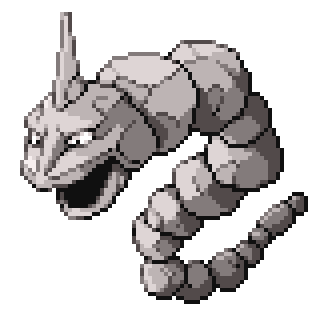
Finally, rock textures are not only useful for Rock Pokémon, but also Steel-types and some Ground-types; really, every rugged, worn, jagged sort of surface. The best example of this is probably just good old Onix. You first have the rock, in some shape which can be reasonably round; then you simply split it into flat surfaces, partly using outlines and partly just letting the shading imply it, and shade it like you would ordinarily shade flat surfaces. It will not look convincing unless you make sure that you both have outlines separating most of your surfaces and that every outline is actually splitting surfaces - that is, it has different shades on each side of it.

For most other Pokémon, you'll do fine with the style of shading on that sphere - they're cartoon creatures and half of them don't look that organic in the first place.
Outline Shading
When shading outlines, the general rule is that the outline is mostly black around the shadow color, mostly the outlining color around the base color, and to some degree the shadow color around the highlighting, although this varies slightly depending on how dark the outlining color and shadow color are. Outline shading guide coming soon... hopefully.
Closing Words
Remember that the golden rule of everything creative is to practice and not to give up. Everyone's first sprites are flawed, so don't feel bad when they're not turning out right. Just keep trying.
Page last modified December 9 2025 at 13:10 UTC
Post comment
Inflammatory or off-topic comments will be deleted; please go to the guestbook for discussion unrelated to this page. You can use BBCode (forum code) to format your messages.
Giving an e-mail address is optional; if it is given, you will be notified by e-mail if I respond to your post. If you fill in a website (this should be your own website, blog or social media profile), it will be linked publicly on your post; however, messages obviously posted solely as a pretext for advertising, or advertising shady or inappropriate websites, will be deleted.
- [b]Bold[/b]
- [i]Italic[/i]
- [u]Underlined[/u]
- [s]Strikethrough[/s]
- [url=http://www.dragonflycave.com]Link[/url]
- [spoiler]Spoiler[/spoiler]
Comments
My own messages will be signed as Butterfree, with the Admin label below my name. If someone signs as Butterfree without that label, it's probably not me.
Pages: 1
 Dave
Dave
 GreenMegaMan33
toxicoke
R
Pages: 1